
Fintech product design case study
SPND on purpose
A mobile money experience designed to help people decide where their income goes before everyday spending takes over.

The problem
Most money apps are good at reporting what already happened. They show a balance, list transactions, and surface charts after spending has taken place. The harder job—deciding what money should do before it leaves—is often left to memory, notes, or a separate spreadsheet.
The design opportunity was to move intention into the product itself: help someone define their inflow, give important categories a role, understand what remains, and still move money without losing the plan.
How might a money app help people make a plan before a transaction becomes a regret?
The project
SPND is an intentional-spending app built around a simple idea: every dollar should have a role. The experience connects onboarding, wallet setup, allocation, transfers, and confirmation into one understandable system.
Instead of leading with financial jargon, the product introduces three direct promises: plan your spending, know your spending, and spend on purpose.

My role
I shaped the experience across product structure, user flows, interface design, interaction states, prototyping, and visual direction. That included defining how planning and wallet actions connect, what information belongs at each step, and how light and dark themes remain consistent.
I also built the visual language around tactile purple objects and soft, rounded interfaces so the product could feel distinct without making serious financial actions feel playful or vague.


Design principles
Plan first
Make the user’s intent visible before presenting a full wallet or transaction history.
Show the maths
Keep totals, category values, and unassigned money close enough to compare without mental calculation.
Confirm clearly
Give high-stakes actions a calm review step and an unmistakable success state.
Planning the money
The allocation journey begins with total inflow, moves into category assignment, and ends with a review. The interface keeps unassigned money visible so the user can see the consequence of every choice before applying the plan.

Moving money
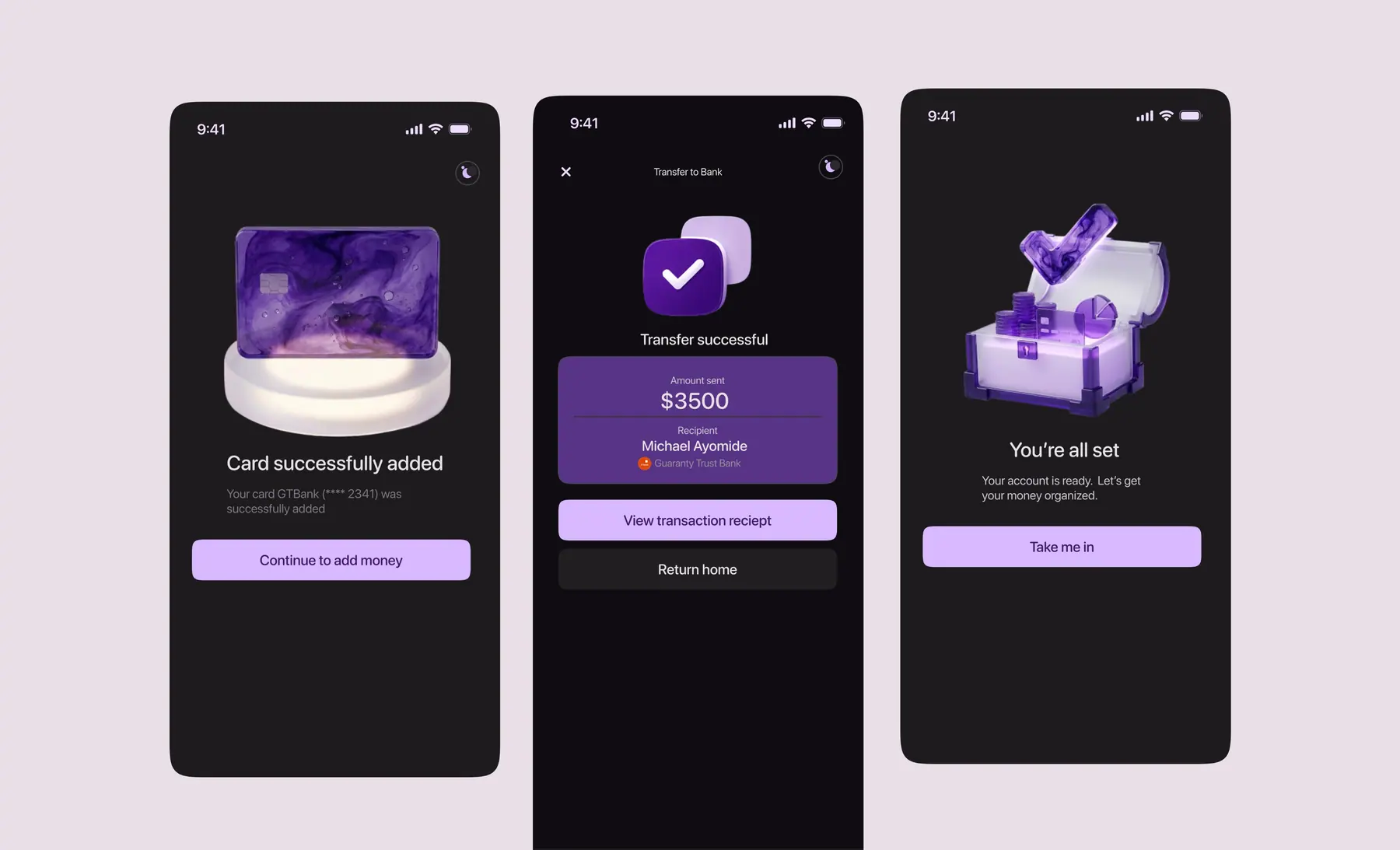
Planning is useful only when it survives real transactions. Before a transfer is submitted, SPND brings the amount, recipient, bank, account number, and fee into a single review card. The success state then confirms what happened and gives the user a clear next action.
Key design decisions
Unassigned money stays visible. The system does not hide the remaining balance while categories are being edited. That turns allocation into a transparent equation rather than a series of disconnected inputs.
Review comes before commitment. Both allocation and transfer journeys pause at a summary state, giving the user a safe point to catch a mistake.
The theme changes, not the meaning. Light and dark modes preserve the same hierarchy, labels, and semantic colours so visual preference does not change how the product is understood.

Reflection
SPND reinforced that a financial product can feel expressive without becoming unclear. The purple identity and 3D imagery make the experience memorable, but the product works because the important sequence remains practical: understand the promise, define the inflow, assign value, review the plan, and confirm the action.
What worked
The planning model, persistent unassigned balance, review states, and focused confirmations create a consistent point of view from onboarding to money movement.
Next
The next phase would validate category language with real users, test how plans adapt when income changes, and explore clearer guidance for partially funded goals.
Have a product idea that needs clarity?